SIMPLE FINANCE
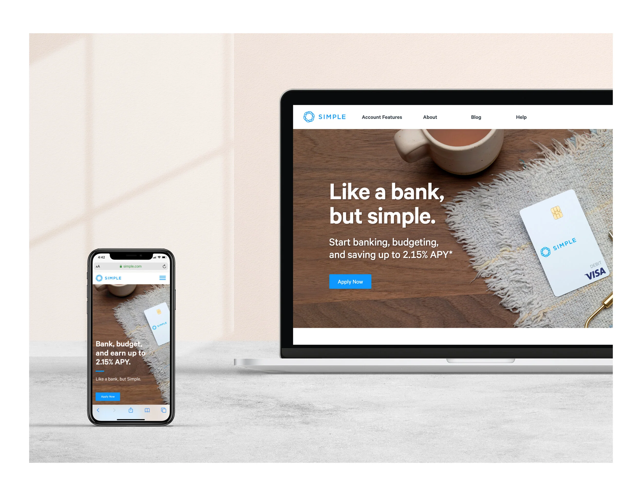
Founded over a decade ago, Simple was among the first wave neo-banks in the financial technology space. It was the fusion of a beautifully-designed budgeting app atop a banking platform, built on the notion that you can genuinely love your banking experience. Customer-centric to its core, it boasted an established and devoted user base. I was brought on board to not only maintain the brand’s high standards, but also elevate its visual identity.
Simple Explainer Video
Art Direction: Christina Nelson
Animator: Mike Smith
Script: Ryan King
VO: Adriana Colón
Simple Blog Re-design
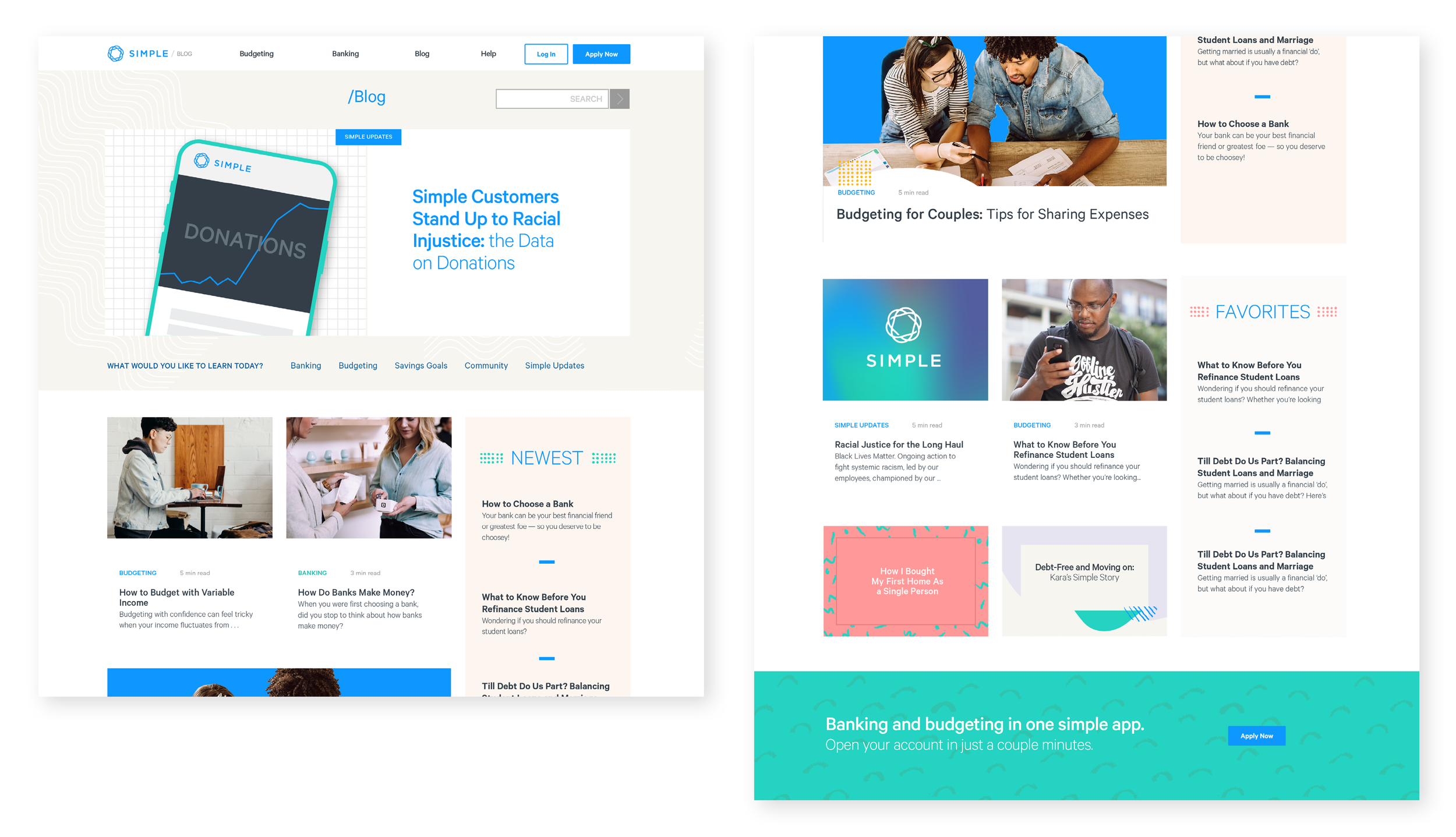
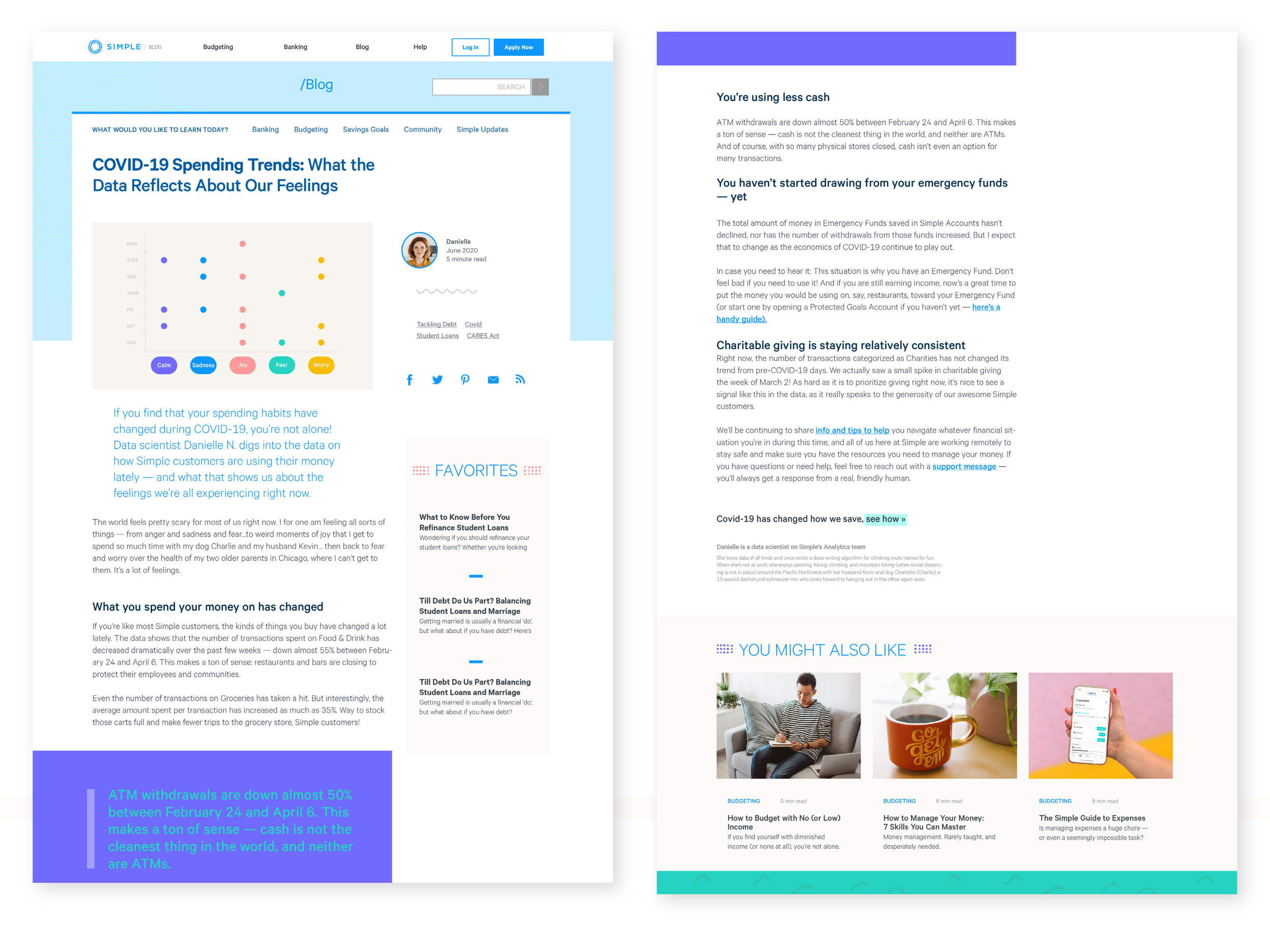
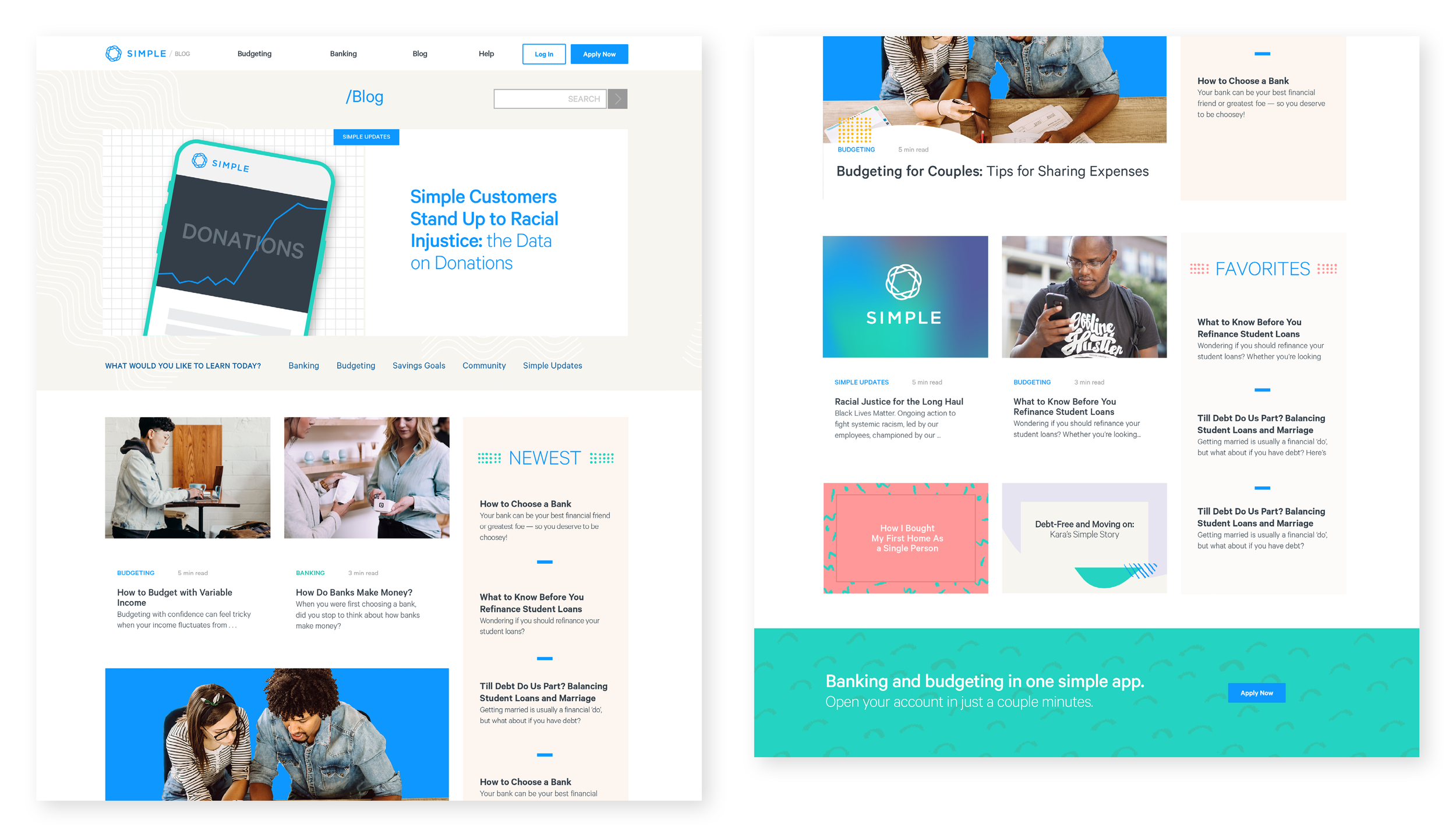
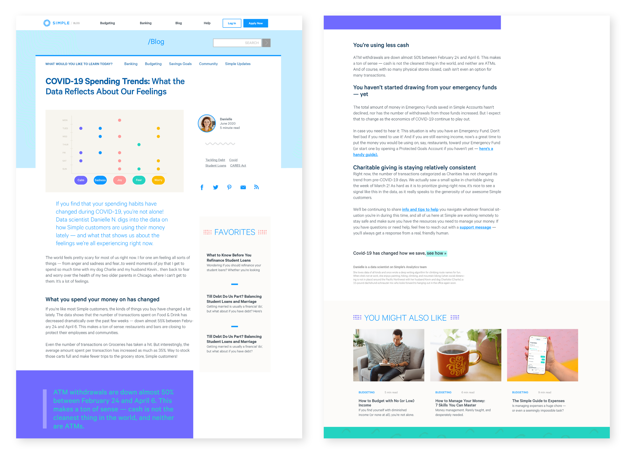
Simple’s mission of financial education for all was hindered by an outdated blog presence and a lack of a robust SEO and content strategy. I prepared two experience navigation concepts, wireframes, and ultimately the final design for the project, which would help promote us as thought leaders in the financial space.
Easily browsable topics to increase time on site
Changed from stock photos to branded illustrations
Collaborated with the content team to implement an SEO strategy and publishing recommendations
Added a search function
Ensured mobile responsiveness
Included product callouts and pull quotes for quick TL;DRs
Created clearer sub-navigation
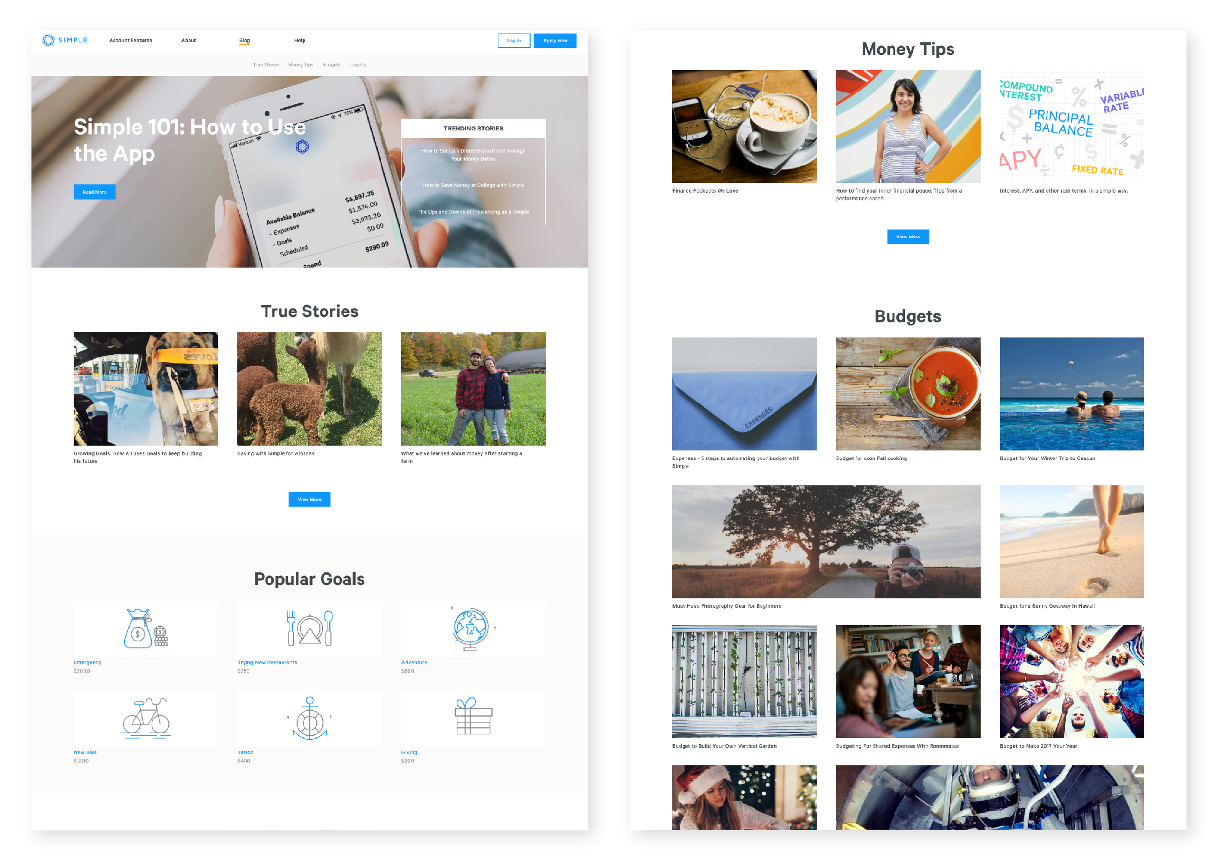
Original Blog Homepage
Round Up Rules Campaign
Simple launched a social and email campaign promoting a new budgeting feature. When you spend from your account, it rounds up and places that amount in your savings fund. The concept was called “Soft Vices” and was based around the idea that small harmless indulgences could help you save for something larger. The visuals play off a “this for that” comparison, “let your late night taco help you save for a trip to Tulum”.
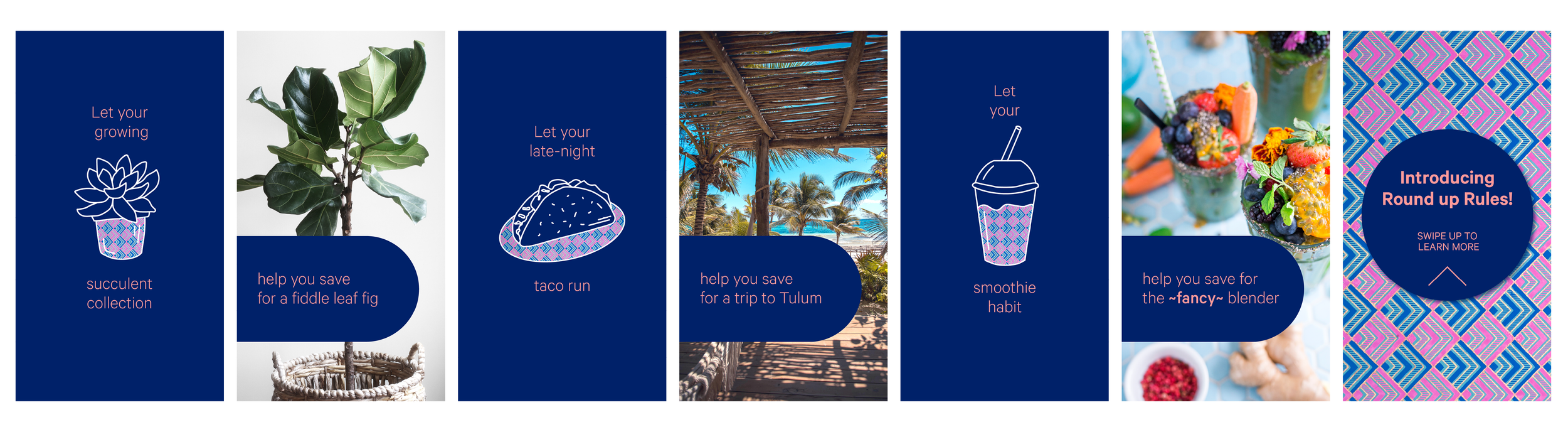
Organic Social
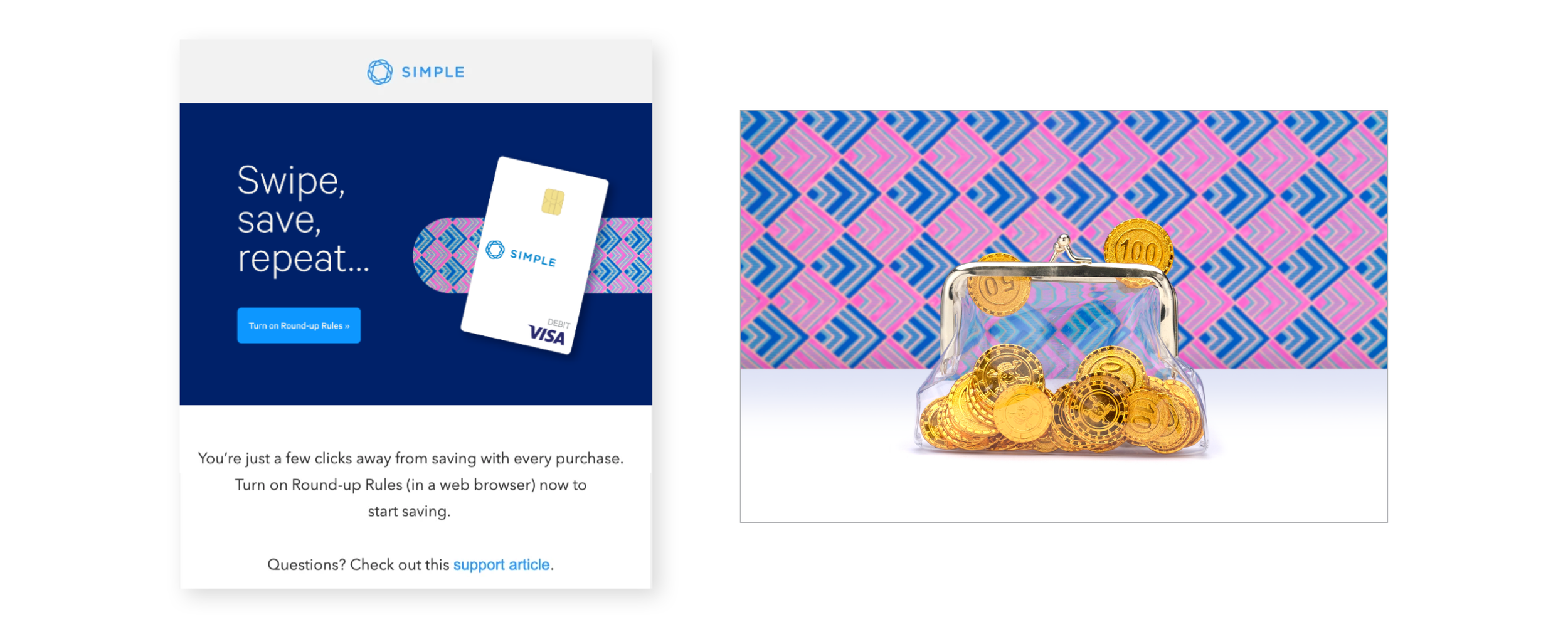
Email + Website image
Amplify Your Impact Campaign
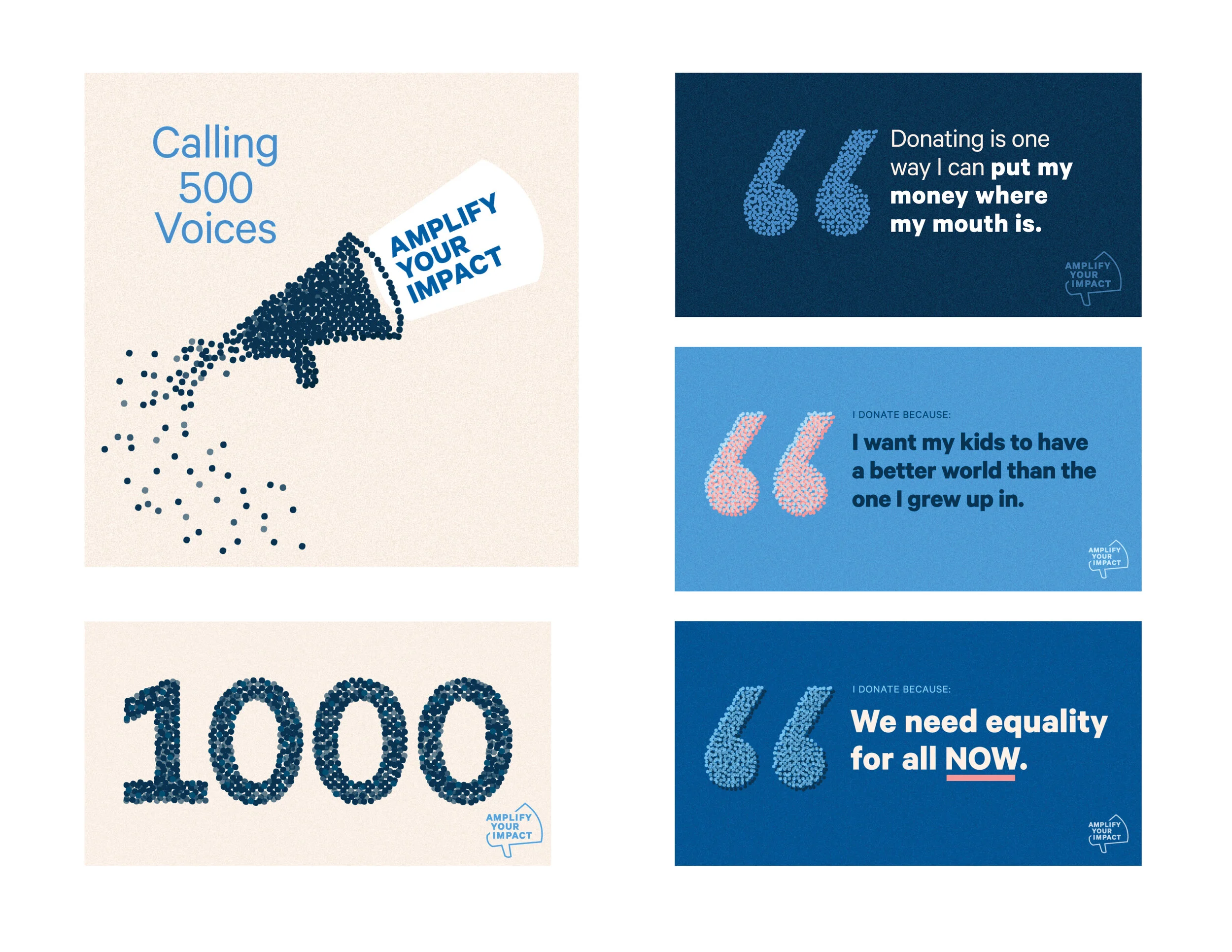
During a challenging year, we aimed to provide our customers with an opportunity to contribute to causes aligned with our company values. We selected two charities to receive amplified donations over a two-week period. For every $5 donated by a customer, Simple pledged $20, significantly boosting the overall contribution. Instead of emphasizing the monetary value, we centered the campaign on the number of donors. I set a target of 500 donations, symbolizing voices, and translated this into the visual concept — 500 small dots representing individual voices coming together to create something greater than themselves.
The campaign was exceptionally successful; midway through, we received an additional 500 voices that we could support, as reflected in the graphic representing 1000 voices.